Preparing the assets
Contents
Background image
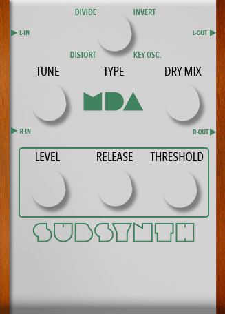
The most important element of the icon is the Background image. This element will define the size of the pedal and all other elements will be positioned on the top of it.
It is very important that this image is properly cropped. You will have to know its exact size to position others elements over it.
This is the background image for the MDA SubSynth:
Now that you have your background and know its exact size, you can crop and generate the images of all other elements.
It is a good idea that, while working on your layout, you take note of the position of each element relative to the background. This will make things easier when you get to write your CSS and also will help you generate all the assets in the exact right size you need.
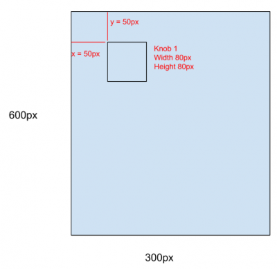
By doing this you can inform precisely to the developer how things should be positioned in the interface, avoiding errors and makes things easier for everyone. Since all elements are positioned relative to the background, you could also easily write some instructions, for example:
All knobs have 80px by 80px.
Knob 1 is positioned 50 pixels from the top and 50 pixels from the left
Knob 2 is positioned 50 pixels from the top and 150 pixels from the left
And so on...
Switches and bypass light
For switches and the bypass light, there are only two states, On and off. In these cases, you will set the css style of each state as you like, so you can use a sprite image (either horizontal or vertical) or even two distinct images. In fact, an image is not a requirement here, if you can achieve the effect you want using only css.
Example
Knobs, sliders and similars
In these cases you will have to use sprite images. They will be handled automatically by the MOD GUI, so they necessarily need to be horizontal.
The only thing you have to keep in mind is that the total width of the sprite must be a multiple of the visible width of the element. The number of steps will be calculated by dividing the background width by the element's width, considering the background-size style.
There is a nice tool you can use called Knobman (https://www.g200kg.com/knobman/) that generates this sprite image for you (https://www.g200kg.com/en/docs/knobman/tutorial.html)
Example (click to see raw image):
In this example you see each step of the sprite has 60px width. In total, the image has 3900px, which means there are 65 steps.
There is not a fixed number of steps your sprite should have. This is up to you. The more steps you have, the smoother the animation will be. For a regular knob, we recommend something around 60 to 70 steps.
If the control port actually have less possible steps than your sprite image, the UI will divide your sprite and use only the number of the steps supported by the plugin. In some cases this might not be a problem, but in others, this can produce an undesired behavior. So always check to see if the number of steps is declared in the plugin (ask the developer or check the pprops:rangeSteps, lv2:enumeration or lv2:toggled parameters)
In SubSynth pedal, for instance, one of the parameters is an enumerated with only four possible values. For that case, this sprite was generated:
Drop down for enumerated parameters
For this kind of elements you may or may not need some assets depending on your layout. You can have background where the selected item of the list will be displayed and another background image for the element that will hold the list. In some cases, the list may be over an element filled with a color with some transparency. In those cases you won't need an image.
If you are not the person who will be coding the HTML and CSS, ask this person what you should do.
Screenshot and thumbnail
Finally, the last two images you need to prepare are the screenshot and the thumbnail.
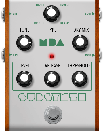
The screenshot is a real size image of the plugin, with all the controllers and buttons. It is used to display a preview of the plugin when the user wants to see details about it.
The thumbnail is a reduced version of the screenshot, used in the plugins bar, at the bottom of the pedalboard assembler, where the user sees a horizontal list of all plugins. This image should have a height of 64 pixels while maintaining the width proportional to its aspect ratio.
This is the screenshot that shows how all the pieces will look when put together:


