Creating the GUI
Contents
The Main DIV
The first element you need to add to your HTML is the main container DIV for your pedal. This DIV will hold the pedal background image and all other elements will be positioned on the top of it with absolute position.
So lets start, add the main div to your HTML:
<div class="mod-pedal my-pedal-name{{{cns}}}">

</div>
Replace “my-pedal-name” with a unique slug for your plugin. The “{{{cns}}}” wildcard will be replaced by the MOD UI with a namespace for each instance of this plugin that is placed on the canvas.
Now, lets add some basic css for this element. Basically, you will have to declare the size of the pedal and add the background image:
.my-pedal-name{{{cns}}} {
    background-image: url(/resources/my-plugin-background.png{{{ns}}});
    position: absolute;
    width: 449px;
    height: 359px;
}
Drag Handle
All pedals can be dragged and freely positioned in the pedalboard assembler, so will be your pedal.
You have to add an element that will indicate the area of your plugin where users will be able to click to drag and drop.
In most cases, for squared-shaped pedals, this is the whole area of the plugin, except controls. To achieve this, you have a div the same size as the background positioned below all the controls, using z-index.
By default, the z-index of the drag handler is 20. With this in mind, you can position all the controls over it.
To add the drag handler element, add this to you HTML:
<div mod-role="drag-handle" class="mod-drag-handle"></div>The mod-role attribute is mandatory. It tells MOD UI that this is the element users will click to drag the plugin. The mod-drag-handle css class adds default styles and is recommended (the 20 z-index and the “hand’” mouse cursor, for example).
If you use the mod-drag-handle css class, there is no need to add any additional rule to you CSS. But if you want to change the area that this div should cover, for example, you may add some rules and change its size however you like.
Inputs and Outputs
In your HTML, you have to add all the inputs and outputs the plugin have. Some may have only one input and output. Some may have multiple inputs and outputs and some may have no input at all. There are also 3 different types of connections: audio connections, MIDI connections and CV connections.
Inputs are always positioned in the left side of the pedal, and outputs on the right.
MOD UI provides you two classes you can use that help you place your inputs and outputs: mod-pedal-output and mod-pedal-input. This classes will be positioned on the right side and the left side of your pedal and, inside the element that has it, you will place all your connections.
The connections are represented by elements holding 2 special attributes:
- mod-role=”input-audio-port” (or the corresponding role)
- mod-port-symbol=”In” (or the corresponding symbol)
Also, in this element you must add the mod-input or mod-output class accordingly.
In the end, for a plugin with one audio input and output, you will have something like:
<div class="mod-pedal-input">
    <div class="mod-input" title="Audio Input 1" mod-role="input-audio-port" mod-port-symbol="In"></div>
</div>

<div class="mod-pedal-output">
    <div class="mod-output" title="Audio Output 1" mod-role="output-audio-port" mod-port-symbol="Out"></div>
</div>
Note: mod-port-symbol MUST match the symbol declared in the plugin’s ttl file.
Possible mod-role values for inputs and outputs are:
- input-audio-port
- output-audio-port
- input-midi-port
- output-midi-port
- input-cv-port
- output-cv-port
Chances are that you dont need to add any additional rule in your css for the connections to work, but you might need to tweak a little bit the position to match your layout.
Simply add a rule and play with the top, left, bottom or right attributes to position them. For example:
.my-pedal-name{{{cns}}} .mod-pedal-input,
.my-pedal-name{{{cns}}} .mod-pedal-output
{
    top: 80px;
}

.my-pedal-name{{{cns}}} .mod-audio-input {
    left: 4px;
}

.my-pedal-name{{{cns}}} .mod-audio-output {
    right: -84px;
}
In the code above we change a little the default position of all connections. The mod-audio-input and mod-audio-output classes are automatically added to the elements that hold the mod-role attribute.
Remember: This is plain HTML and css, you could add any class you like and any css rule for them, you don’t need to use only these provided classes.
Bypass switch
Every pedal should have a bypass switch, a ON/OFF button.
This switch is represented by an element holding the mod-role attribute as “bypass”.
<div class="my-switch-class" mod-role="bypass"></div>Here we must add a class so we can add css rules for this element.
We will need to:
- position it
- set its size
- set its background image for each state (on and off)
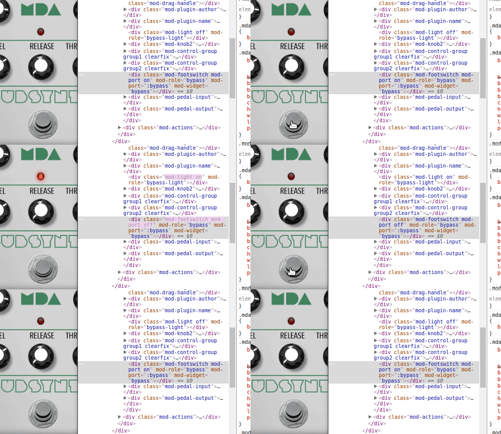
MOD UI will automatically add the classes “on” and “off” to the element, indicating its state.
Note: When bypass is on, it means that the signal is bypassing you plugin. So, bypass ON means your plugin is OFF, and bypass OFF means your plugin is ON.
It’s recommended that you use an sprite image for the switch, and simply change its background-position for each states.
So for an image like this, which is 176x88, we would have a css like this:
.my-pedal-name{{{cns}}} .my-switch-class {
    position:absolute;
    background-image:url(/resources/footswitch.png{{{ns}}});
    background-position:top center;
    background-repeat:no-repeat;
    background-size:auto 176px;
    cursor:pointer;
    height:88px;
    width: 88px;
}

.my-pedal-name{{{cns}}} .my-switch-class.on {
    background-position:top center;
}
.my-pedal-name{{{cns}}} .my-switch-class.off {
    background-position:bottom center;
}
You will also probably have to add to this rules the “left”, “top”, “bottom” or “right” parameters to position your switch.
Note: When referring to images in your css, “/resources” will point to the directory where your modgui assets are, as declared in the modgui.tll file. See “Preparing the bundle”
This is the final result you want
Bypass light indicator
To add a bypass light to indicate when your plugin is on and off, you will add another element in very much the same way you added to switch.
You will need an image sprite, that will hold the two states of the light indicator, and play with the background position to change the state.
First, add the element that will hold the light, with the according mod-role property:
<div class="my-plugin-light" mod-role="bypass-light"></div>Also add a class that you can use to reference this element in your css stylesheet. In the exemplo above, we added “my-plugin-light”.
Note: If you want to use the default MOD UI red light, just add the “mod-light” class and all the behavior and images will be added automatically. You will only need to position the light wherever you like in your pedal.
This is the result with the default light indicator:
If you want to user your own image, now we need to add the css rules. You will need to position the element, add the background image and change the background position for each state. MOD UI will automatically add the classes “on” or “off” to your element.
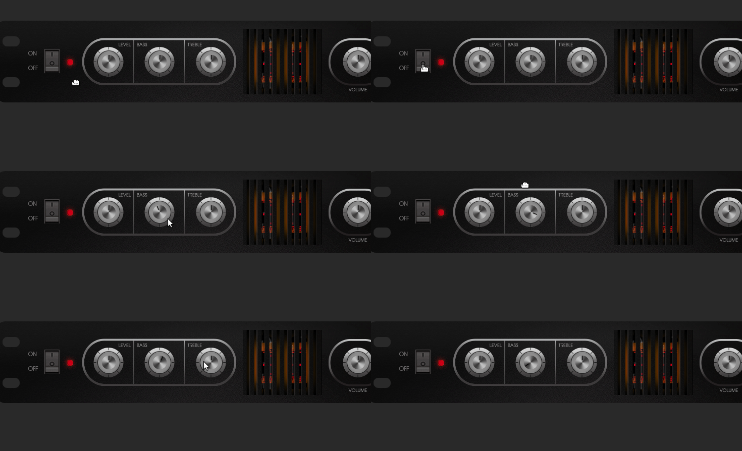
For this example we will use the Guitarix Cream Machine plugin, that has a very different light indicator. Look at this:
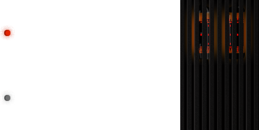
As you can see, the light indicator may be more than just an tiny image of a LED. To achieve this, we used this sprite image:
Playing with positioning and z-index we make sure it is in the right place an below all the controls. Note that, as we also want user to be able to drag the pedal clicking over the valve, we had to position it below the drag-handler element.
So this is the css for this light indicator:
.mod-cream-machine{{{cns}}} .cream-machine-valve {
    background-image: url(/resources/switches/mod_cream_machine_light.png{{{ns}}});
    height: 129px;
    width: 513px;
    position: absolute;
    left: 133px;
    top: 13px;
    z-index: 15;
}

.mod-cream-machine{{{cns}}} .cream-machine-valve.on {
    background-position: top left;
}

.mod-cream-machine{{{cns}}} .cream-machine-valve.off {
    background-position: bottom left;
}
In the code above note how we:
Add the background image Set the size and position of the element Set the z-index to 15, below the drag handler Change the background position for each state
Input controls
. Knobs and sliders using image sprites
To use Knobs and Sliders you will use sprite images the same way we showed in the switches and light indicator sections. The difference here is that MOD UI will automatically handle the background position changing behavior, so all you have to do is to set the element size, position and inform the background image.
Lets work again with the Cream Machine plugin as an example.
First, add the element that will behave as a knob or slider:. This is the basic structure:
<div class="my-plugin-level-knob" mod-role="input-control-port" mod-port-symbol="LEVEL" title="LEVEL"></div>You must add: A css class that will allow you to add some css to it Mod-role = input-control-port Mod-port-symbol = The exact symbol that is declared in the TTL file Title = The name of the control
Usually a plugin may have more than one knob, for different controls, but all of them will share the same sprite image. Therefore is a good idea to create a generic knob class for your plugin, that will handle the size and the background image, and a specific class for each knob, to control only the position.
In Cream Machine, all knobs also share the “top” css property, as they are all positioned at the same height over the plugin. So this is the example extracted from Cream Machine:
<div class="cream-machine-knob cream-machine-knob-level" mod-role="input-control-port" mod-port-symbol="LEVEL" title="LEVEL"></div>

<div class="cream-machine-knob cream-machine-knob-bass" mod-role="input-control-port" mod-port-symbol="BASS" title="BASS"></div>

<div class="cream-machine-knob cream-machine-knob-treble" mod-role="input-control-port" mod-port-symbol="TREBLE" title="TREBLE"></div>

<div class="cream-machine-knob cream-machine-knob-volume" mod-role="input-control-port" mod-port-symbol="VOLUME" title="VOLUME"></div>
And the CSS
.mod-cream-machine{{{cns}}} .cream-machine-knob {
    background-image: url(/resources/knobs/mod_cream_machine_knobs.png{{{ns}}});
    height: 43px;
    position: absolute;
    width: 43px;
    top: 60px;
    z-index: 40;
}

.mod-cream-machine{{{cns}}} .cream-machine-knob.cream-machine-knob-level {
    left: 203px;
}

.mod-cream-machine{{{cns}}} .cream-machine-knob.cream-machine-knob-bass {
    left: 304px;
}

.mod-cream-machine{{{cns}}} .cream-machine-knob.cream-machine-knob-treble {
    left: 406px;
}

.mod-cream-machine{{{cns}}} .cream-machine-knob.cream-machine-knob-volume {
    left: 697px;
}
Enumerated Controls
Enumerated controls are used to handle control ports that have a fixed list of possible values. A typical enumerated control is a Select box from which the user can select a value from a list, for example, the amp model in an amp simulator.
There are 3 ways to build an interface for enumerated controls in your plugin HTML:
Using a simple Select HTML tag Using a custom select interface Using image sprites
Enumerated controls using Select
To handle enumerated controls using standard SELECT HTML element, simply add the element with the appropriate “mod-role” and “mod-port-symbol” attribute along with the “mod-widget” attribute:
<select class="my-plugin-enum" mod-role="input-control-port" mod-port-symbol="Model" mod-widget="select">

    <option value=”0”>Dynacord M35 2x12</option>
    <option value=”1”>Fender Princeton 2x12</option>

</select>
So, if you use mod-widget="select", this element is expected to be a <select> and contain several options, each of them must have the value attribute reflecting the float value of this property.
To find out the possible values and labels, check your plugin’s TTL file. The values above, for example, are extracted from the MOD Cabism Vintagem Amp simulator, and shows in the TTL file like this inside the “Model” port definition:
...
    lv2:scalePoint
    [
        rdfs:label "Dynacord M35 2x12";
        rdf:value 0
    ],
    [
        rdfs:label "Fender Princeton 2x12";
        rdf:value 1
    ],
...
Finally you can add any css styles you like to your select control.
Note: This approach is mainly intended to be used for ports with the lv2:enumeration property, but can be used for any case in which picking values from a limited set is desired.
Enumerated controls using a custom select interface
This widget is similar in functionality to select widget, but instead of a select html element holding options, you can choose any element types to represent the widget and the options. If you use mod-role="custom-select", this element is expected to have children elements with the attributes mod-role="enumeration-option" and mod-port-value="(float value)". The selected element will receive the selected class, and so you can define your CSS as to highlight it as desired.
This is the example of HTML and CSS for the Mod Cabism Vintage plugin:
<div class="mod-enumerated" mod-role="input-control-port" mod-port-symbol="Model" mod-widget="custom-select">
        <div mod-role="input-control-value" mod-port-symbol="Model"></div>
        <div class="mod-enumerated-list" >
                <div mod-role="enumeration-option" mod-port-value="0">Dynacord M35 2x12</div>
                <div mod-role="enumeration-option" mod-port-value="1">Fender Princeton 2x12</div>
                <div mod-role="enumeration-option" mod-port-value="2">Friedman 4x12</div>
                <div mod-role="enumeration-option" mod-port-value="3">Laney 112C</div>
                <div mod-role="enumeration-option" mod-port-value="4">Friedman 4x12</div>
                <div mod-role="enumeration-option" mod-port-value="5">Marshall Plexi</div>
                <div mod-role="enumeration-option" mod-port-value="6">Matchless Chieftain</div>
                <div mod-role="enumeration-option" mod-port-value="7">New Vintage 2x12</div>
                <div mod-role="enumeration-option" mod-port-value="8">Peavey 4x10</div>
                <div mod-role="enumeration-option" mod-port-value="9">Vintage Sounds 22CS</div>
        </div>

</div>
.mod-pedal{{{cns}}} .mod-enumerated {
left: 143px;
width: 131px;
position: absolute;
bottom: 1px;
color: #b9b4b4;
font-size: 10px;
cursor: pointer;
padding: 5px;
z-index: 21;
line-height: 20px;
}
.mod-pedal{{{cns}}} .mod-enumerated .mod-enumerated-list {
background-color: rgba(51, 51, 51, .9);
display: none;
position: absolute;
bottom: 23px;
width: 200px;
max-height: 150px;
overflow-x: hidden;
overflow-y: scroll;
font-size: 12px;
}The child elements that hold the values can be grouped in an element that will be hidden and displayed only when the user clicks the main element, or can be always visible. Its up to you and your css code.
If you want the element to be hidden and toggle visibility as you click, add the “mod-enumeration-list” to it. See the example above.
In the example above there is also an element with “input-control-value” as it’s mod role. This is used to dislpay the current selected value. See “Outputting values” section for more details.
Enumerated controls using image sprites
You can use an image sprite, of a knob, slider or any other kind of control, to handle enumerated control ports.
To do so, see “Knobs and sliders using image sprites”. MOD UI will detect how many options your enumerated control has and automatically calculate how to position the background image of your element.
For example, if you have a sprite image with 60 steps, and an enumerated control with 6 options, MOD UI will move your knob or slider 10 steps at a time, leaving only 6 possible positions.
If you want more control on each state of your sprite image, you should create a custom sprite image with only the number of steps you are going to use. See Preparing the assets#Knobs.2C_sliders_and_similars for an example.
Outputting values
There are 3 “mod-role” you can use to display information dynamically in your plugin:
Input-control-minimum: will display the lowest possible value for the port Input-control-value: will display the current value for the port Input-control-maximum: will display the highest possible value for the port
To use these elements, simply add the “mod-role” and the “mod-port-symbol” attributes to an element and MOD UI will update it’s HTML content with the corresponding value for the port informed in the “mod-port-symbol” attribute.
Example:
Minimum: <span mod-role="input-control-minimum" mod-port-symbol="Attenuation"></span>

Current: <span mod-role="input-control-value" mod-port-symbol="Attenuation"></span>

Max: <span mod-role="input-control-maximum" mod-port-symbol="Attenuation"></span>
Advanced
Using javascript for interactive interfaces
TO DO
Monitoring outputs
TO DO


